Introduction

I am in group 1 with Pru Carter-Phillips (8128) and Ella Budgett (8120). To view my portfolio evidence please click on the following three labels, on the right, named; A2 Research and Planning; A2 Construction and A2 Evaluation.
Please view our music video for MiraJax - Best Be Believing

Please view our music video for MiraJax - Best Be Believing

Front and Back Digipak

Front and Back Digipak
Above shows the front and back panels of our digipak

Inside Digipak

Inside Digipak
Above you can see our inside panels of our digipak


Please click this image to enter our site

Tuesday 20 December 2016

Construction Post 6: Website post production

Editing our (almost) finished website:

As I mentioned previously, we used the website creator "Wix" to design and publish our website. None of us had used Wix before so we were excited to see what it offered.

We all found the website very slow so it was really challenging trying to make changes when the actions you were trying to complete were actually completing 10 seconds later than you wanted them to; we all found this highly frustrating. We also found that the "anchor pages" ( the blue line across the page shown below ) would move around every time we logged into Wix.


This wasted a bit of our time because we had to reposition the pages before editing the website every day. However, it was still very exciting and satisfying seeing the website fall into place.

We decided to have 3 pages on our homepage which would automatically flick through as the viewer opened the website. 

Homepage page 1:


Homepage page 2:


Homepage page 3:


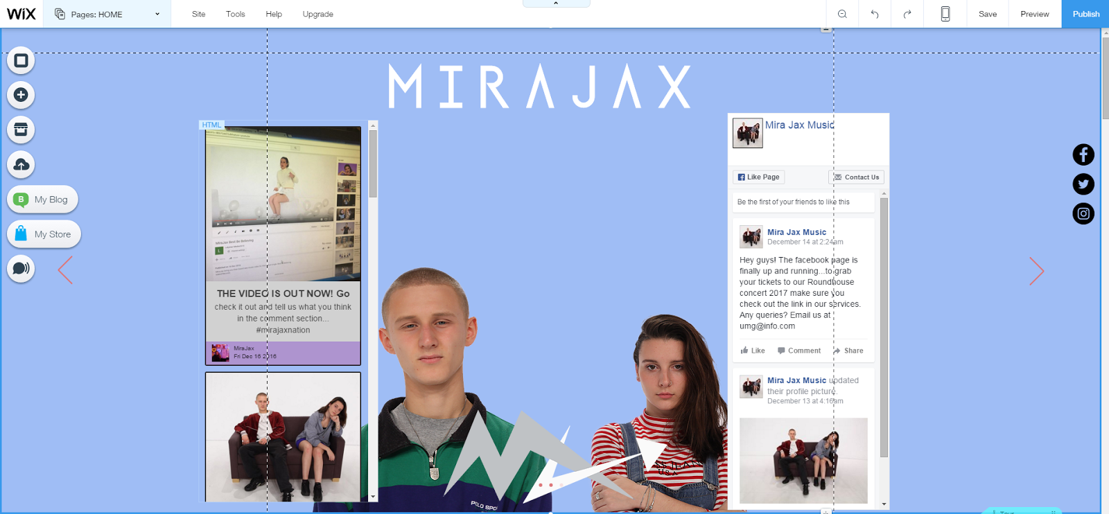
All of our homepages feature an image of both Mira and Jax and our logo. We felt this was key in order to establish our brand and after our TA said they'd expect lots of images of the artist/band on their website. 

Originally, "Homepage 2" was our first homepage when the viewer entered the website. However, after speaking to some members of our TA, they informed us that, although the website looked incredibly professional, it was not clear that it was a music artist's website. They said it could have been a photographers blog or artist's blog. This is why we made "Homepage 1" our new first page, immediately establishing our brand, new album and artist duo. 

 We have 3 different ways the viewer is able to purchase through our site: 


From all the existing music artist websites we have researched, we didn't find a single one that did not have at least 3 social media links on at least one of their website pages. For this reason, we stuck to this convention and included 3 social media links on the right had side of our website which appear no matter where you are on the website. 

a visual presentation of the MiraJax Instagram feed  
social links

As well as this, we also created a visual summary of our Facebook page and our Instagram feed on one of our homepages. This way the audience's interest is captured by the visual presentation of our social media page, which will hopefully make them want to view more.

We had some complications with creating our news page. When adding the 'blog' feature which we would be using for our news, it had to be on a separate page. However, we wanted our whole website to be on one scrolling page so the only way we could get around this was to create a link on the scroll page to our 'news' page (the blog feature). This wasn't ideal but we didn't want to sacrifice our news page.


The link above goes to this page:


We created a couple of competitions and meet and greets which allows the audience to engage with MiraJax. Our TA thought this was an "interesting feature" that they'd expect to see on a "professional" website...so we will definitely be keeping it! 

We added an interactive way that viewers can play MiraJax's brand new single:


From talking to members of our target audience who said they'd expect lots of pictures and videos on an artist's website, we dedicated a whole page to "videos and photos". 


Here we have, firstly, our music video for Best Be Believing, then we have a grid of images of Mira and Jax, followed by, finally, a BTS video from our music video shoot day. 
When clicking on an individual image, the image is made bigger and the background fades like so:


Although our website is one scrolling page, the viewer can also navigate via the menu bar at the bottom of the page which provides a shortcut to any particular page. 


Previously, we had not set up a payment account for the store on our website. With advice from our teachers, we added a payment method in order to increase professionalism. As well as this, we were advised to incorporate a shopping cart symbol somewhere which would be visible on every page, so the viewer can check their cart at any time. This is shown above next to our labelled page "shop". 

Another feature we added so the audience could keep up-to-date with news on MiraJax was this subscription box:


This allows the audience to sign up to the MiraJax mailing list where they will be sent regular updates via email, so as never to lose track of anything to do with MiraJax!

me editing the website
Target Audience Feedback:

I spoke to Emma, a 17 year-old female friend, who gave us some very useful feedback on the finished website. Here is what she came up with:

Is the website easy to navigate around? Yes, I can see there are lots of buttons on the menu bar leading to different pages.

What do you like about the website? It looks very modern and I love the colour scheme! I like the fact the audience is given two ways to navigate around the website. It's good you have lots of pictures of Jack and Ella (Mira and Jax). The listening thing is cool! (the song playback feature) 

Any improvements that could be made? I don't like how the song plays without you clicking 'play' as soon as you enter the website-this is distracting. Apart from that, I'm impressed!

From this feedback we did actually scrap the automatic playing of Best Be Believing on our website.

Monday 19 December 2016

Construction Post 5: Digipak post production

Creating our Digipak:


These are the templates we used to base our front and inside sleeves around. On Photoshop they were colour coded like so:


All text had to stay within the green area, however images had to be bled over to the red edges.
I feel like I learnt a lot of new skills on photoshop as previously it was definitely not my strong point.


Firstly, we followed our planned front album cover but when we had created it, Miss Blackborow told us she thought the front and back panels were too similar and needed some more variety. We all agreed with this and so brainstormed ideas of how we could alter our previously planned album cover. We decided to use one of our studio promo shots for the back panel. It was a choice between one of these two images:


The reason we chose these images is because they had space around the actual image where song names could fit as well as institutional information. We finally decided on the image of both Mira and Jax because as they are an artist duo, we didn't want the sole focus to be on Mira.
me editing the album using photoshop

Photoshopping the images was quite a time consuming task although it was also very satisfying being able to develop my current skills as well as learning loads of new techniques.

After deleting the background of the image of MiraJax shown above, we then had to choose a background image which would stretch across the front and back panels. We decided on this picture:


In photoshop we used the tools on the right hand side of the screen to edit the image itself. 


Firstly we used the colour balance tool:

This allows you to alter the colours in the image, completely changing around the colour wheel of everything in the image. 


We then used the levels  adjustment tools to change the tonal range of the image and the colours in the image:

Lastly, we altered the saturation levels to make the colours much more intense. As you can see in the finished product...


...the image has been completely transformed which makes the neon lights, especially, stand out. 

The front panel was the most tricky to edit. We began with Mira's face covering two thirds of the panel and Jax's face being squashed into the remaining third. However, our teacher Miss Dymioti flagged this up as looking very cramped and un-easy to look at. We agreed and so reflected on our previously planned front panel, changing the 1/3 / 2/3 split screen into a 50/50 split screen. 

After editing Jax and Mira's individual close-up shots, we positioned them on the front panel. We used the skin smoother tool to airbrush their skin. We also used the brightness adjustor tool to make their eyes brighter and stand out more. 


This is the final result of the front digipak panel:


All our font for titles, song names and artist names are the same, trademark font 'Asgalt Regular'. This font is repeated in our headings in our website also, which increases synergy across our brand. 

We used this image for our inside panels:


Audience Feedback:

I spoke to a friend outside of school (she is 18) to ask her for her thoughts on our finished digipak. 

Would you buy this album? I think if I saw it on a shelf I'd definitely pick it up to have a closer look...it's different to some of the album covers out there; It's cool, I like it a lot.

What age group do you think would buy this album, judging by the look of the album cover? I think, because of the age of the artists and the quirky style of their clothing and wherever the shots were taken, this album would be attractive to older teens and people in their early 20s. I definitely think that both girls and boys would like it too though, because the artists are relatable to both genders.

How professional does it look on a scale of 1 to 10? I'd say around 8.5. I think it looks incredibly professional, however I think by the how the front panel looks, you could maybe guess they're not real music artists just because its not as slick as say, Justin Bieber's album covers. But in saying this, maybe this is purposeful because they're not your everyday music duo. 

Overall, we are very happy with the positive feedback we have received and understand that with the tools we had available to us, there was only so much in terms of professionalism that we could achieve with our album cover. However, we definitely wanted to come across as something new and different through our album cover, which we believe to have achieved. 

I'm very happy with our final digipak panels. There was only one issue which our teacher notified: Jax's coat was previously blending into the background too much (I changed this).

Construction Post 4: Music video post production


Image result for adobe premiere pro
Editing Our Music Video:

We used Adobe Premiere Pro to edit our music video.

After cutting down all our shots and snapping into their rough order, we then got down to the more detailed editing.

We started by cutting our shots precisely to the beat of the music we wanted them to fall on.

Next we put the split screens into place.

what a split screen looked like on the timeline

what a split screen looked like on the project monitor
These were fairly straightforward to create and we didn't have much complication here. Although, we had to zoom into some shots to make the framing as similar as we could to the opposing side of the split-screen.

After we had done all these steps, we believed our music video was finished, apart from grading. So we showed our project to our teachers in order to get some constructive feedback. Miss Dymioti told us that for the bridge of our track, we had no 'out-of-the-ordinary' footage; meaning that there was nothing new to see for the audience that they hadn't already seen. We knew from our research that music videos always had some sort of altered footage for the bridge of the song as this is the part of the track which breaks from the ordinary flow of the song.

For this reason we added grid-like, rotating visuals of Mira and Jax's close-ups.

this is what the bridge section looked like on adobe premiere pro
And this is what it looks like in our finished video:


The bridge combines fast and slow pace editing to create a montage of interesting visuals that we believe will excite the  viewer more than the montage editing we have been using for the majority of the video; it also provides variation.

We used cross dissolves in the footage after the grid which merged shots of Mira and Jax together.


At the end of the song we added an effect called "dip to black"which looked like this on adobe PP:


This is what it looks like in our finished video:


Finally, we had to grade our video. Firstly, we used the three way colour wheel. However after getting feedback from our teachers, they advised us to use the brightness and contrast tools instead because the colour wheel wasn't making a significant enough difference. The three-way colour wheel was also very tricky to use without completely discolouring the shot.
three way colour wheel tool


We used these effects instead:

brightness and contrast and levels tools

We found they gave us a much richer colour without altering the colour that was already there.


Before grading:


After grading:

As you can see, the colour is much richer in the AFTER picture which we are very happy with.

Audience Feedback:

We gathered some audience feedback from a couple of people in our year; a boy and a girl. We asked them what they likes about our music video, what they think could be improved on, whether it looks professional and what audience group they think would watch this kind of video.

They both loved the concept of the video and how the story unfolded as well as the fact we opened the video with a brief argument scene before starting the track. They both noticed our use of split screens and our three-colour colour scheme and commented on how they really liked that use of visuals.

However, when asked on what we could have improved on, Rianna told us she thought the close up of Ella in the blue set-up was slightly blurry although she wasn't sure if this was due to the quality setting on YouTube or the actual footage. Below is the shot she was talking about:


When making our final edit we did realise we needed a tight close-up of Ella which we didn't have for the blue background so this is the reason why we had to zoom into another shot making it blurry. Unfortunately it was too late for us to film a new shot.

They both agreed that our final music video looked very professional, especially the white set-up. When asked what age group they believe our video is best suited to, they both said "teens" which is exactly what we wanted to hear! So, overall we were very pleased with the feedback we received.

Saturday 10 December 2016

Construction Post 3: Week 3 production

Filming:

We started our main shoot week on the Monday of the week beginning the 21st November.On the Friday prior to this Monday where we were scheduled to start filming, there was some complications due to medical issues with me meaning that I still had a dressing around my head from a recent operation. We had to rethink our ideas quickly and logically as a team and Ella put herself forward to replace my role of "Mira" in our music video which we were all very thankful for.

This is our main shoot schedule
We closely followed our shoot schedule and got all the shots we planned to get, every day.

Studio Shoot:

Monday:

On Monday we were scheduled to film our white set-up. This was the simplest and quickest set-up to prepare because all the lights were left white. I prepared the set by laying down our balloons and white box lights while Ella got herself dressed and did her make-up in the natural look we were going for. I then helped her with her hair and we were very happy with the end result.

Below is a short clip of a close-up we filmed showing her hair styling and make-up.


We were able to use the dolly in the main shoot which we didn't use in the test shoot. This was fun to experiment with and I think the shots turned out really well with the white background particularly as it made the room look distorted almost.
we had to make sure all our shots were focused and we did this by zooming in and focusing their eyes

Below is a shot I filmed on the dolly which I particularly liked. I had to take a few shots until I got the curve completely smooth.


We spent the whole day doing this white set-up and everything went according to plan; we even got to wrap-up early.
filming the close up of Ella WHITE
Here's a behind the scenes video of me fixing Ella's hair...


Tuesday:

We started afresh on Tuesday morning with our blue set-up. I scattered some blue fake flower petals on the floor of our cyclorama and added the box lights on the blue setting. We had already saved our lighting set up for blue in our test shoot so I just had to adjust some of the light positions with Emma and lighting was done!
Me focusing Jack for the mid shot


Above is a clip of a few sections within our full song dolly shot which have been merged together. I really enjoyed filming on the dolly because it was something I had never tried before and I was impressed with the effect it gave. The dolly shots were essential in creating variety in our music video in order to keep the audience entertained.
Ella's blue make-up/hair look 

We wrapped up our shoot with a reflections video...

               
( when I say "shots" I mean lights!)
Below is the rush we took which I talk about in the reflections video. We decided not to use this footage in our music video as we didn't like the angle.

              
The behind the scenes of the floor shot!
Us moving the set around until it looked perfect on the monitor
Wednesday:

On Wednesday we filmed our pink set-up. This was my favourite set-up because I really liked the way Ella's hair, make-up and outfit looked and I enjoyed setting the lights up; they looked really cool.


Above is a clip of some of the 'beauty' shots Pru took showing Ella's hair and make-up.

I also really enjoyed filming the dolly of the pink set-up. I have inserted a clip below of the best bits.


We didn't have any complications while filming this set-up and we were very happy with the outcome.

Thursday:

On Thursday we filmed pick-ups where we needed them. We only decided to film a few extra close-ups as we realised we were lacking in them after re-watching our footage. We managed to also do some editing because we finished early.

Jack and Ella's performance skills were very good so we didn't need to re-film anything regarding that side of things.

Friday:

On Friday we had planned to take our promo shots. We had previously taken all our promo shots on location so all that was left was to get the close-ups of Jack and Ella for the album cover, and a range of shots for our website.

This was our plan for the studio shots:


We took photos in 4 different set-ups in the studio:
Ella by herself wearing short strapless evening dress

Jack and Ella in the white set-up wearing casual clothes and lounging on a sofa


Jack and Ella on a green background wearing camouflage-type print clothing

Jack and Ella wearing brands popular among youth culture in London-trendy style


The album cover close-up of Ella

The album cover close-up of Jack

We were very pleased with all of our studio promo shots and location shots and are thankful we took such a range and so many as we are now able to make a whole page on images on our website. It is very important to offer a variety of visual representations of our artist keeping in line with their style which appeals to the TA, and we believe we achieved this.